Feijoa and Open Sans are the Cambridge fonts and are available to download. They are used to ensure all our communications are delivered consistently, to all audiences on all channels.
Primary font
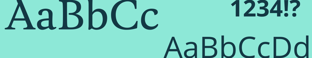
Feijoa is our primary font. It makes an impact.
Use it in headlines, titles and quotes.
Secondary font
Open Sans is our secondary font but we'll use it the most.
Use it for subheadings and in body copy.
Download fonts
Download Open Sans from the Google fonts library
Default fonts
Some apps and programs cannot use our fonts. For example, PowerPoint presentations on external devices. When this happens, you can use Arial in regular or bold.
Text alignment
- We use left alignment.
- We use centre alignment sparingly for short amounts of text. No more than 3 lines is the acceptable length.
- We avoid right-aligned and justified text because these are harder to read.
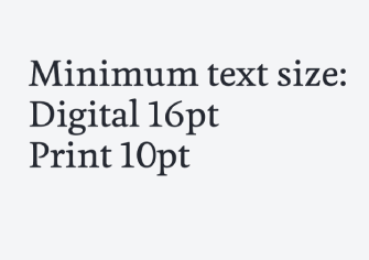
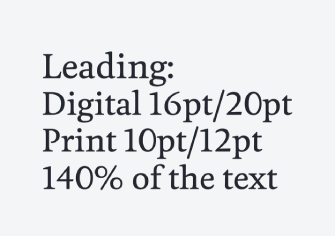
Typography best practice
Creating emphasis
Different weight fonts provide flexibility. This can range from big and bold to elegant and refined.
You can use bold fonts to create emphasis in print documents.
Avoid adding bold formatting to text on websites, emails and digital materials.
Example for print documents

Creating hierarchy
Hierarchy and content structure help your audience to navigate through content.
Create hierarchy by combining font styles.
- For eye-catching headings, use Feijoa and Bold.
- For body copy, use Open Sans Regular, and add emphasis using Open Sans Bold.
- For image captions, tag lines, and links, use Open Sans Bold.
Use headings to create correct and appropriate content hierarchy on web pages. Your site's theme should be configured to style and display headings in line with these typography guidelines.